PHILWEBSUPPORT.COM

Tuesday, January 25, 2011

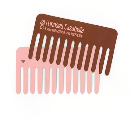
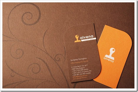
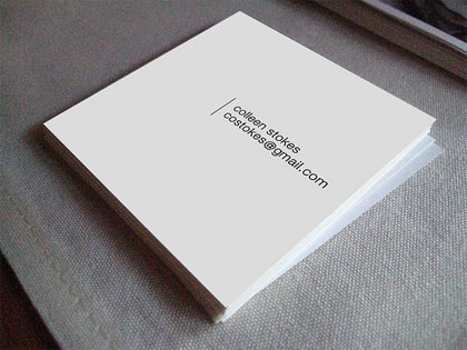
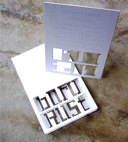
Business Cards 24 designs

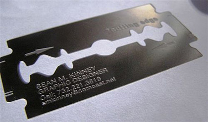
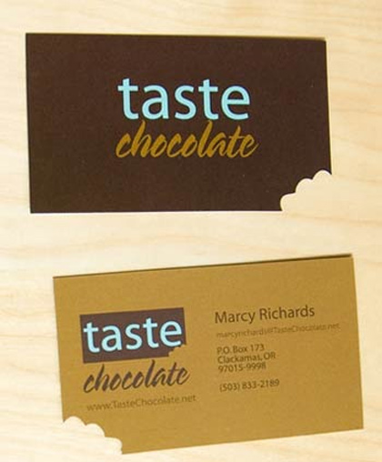
Nowadays, business cards are no long in rectangle shape, people are trying to be creative to attract more attention and to give a better impression to other people. Unlike those ordinary business cards, they come in rectangle shape, in this collection, I have found 24 business cards in a shape that you might not even could imagine.
Affordable Business Card Printing Available at PsPrint.com

Labels: , , , , , , , ,

Sunday, August 9, 2009

Thursday, July 2, 2009

Saturday, June 13, 2009

Effective Strategy To Estimate Time For Your Design Projects

How many times have you been completely confused at how that ’small’ project turned into such a big one costing double and taking three times the length you estimated? Many of you will say estimating time for web projects accurately is an oxymoron, but by applying a few effective techniques it’s possible to dramatically increase the accuracy of most web project estimates.
1. Why Underestimating Is So Common
There are several reasons, which are freely admitted amongst freelancers and web agencies, as to why web projects are so commonly underestimated - they include:
The technologies required by the project have never been used before
At the time of estimating, there are grey areas or complete unknowns
The client operates in a specialized industry and the solution needs bespoke features that are not familiar to the supplier
Splitting the project down into the detail would require as much as work as the requirements gathering phase that is chargeable

However, there are also some secret reasons why web projects are commonly underestimated:
The client needs an estimate for their project tomorrow or they will go elsewhere
Revenue needs for cash flow now trump the effects of not winning the new work now
No previous project ‘estimated vs. actual’ data analysis has been conducted to draw on
Estimating time for a project is not fun
Despite being true, rarely do we admit these reasons to others or even ourselves! The fact is, when working as a web professional, as a one man band or as part of a small busy web team, the secret reasons are an everyday reality that shouldn’t be hidden away.
By first identifying and admitting why underestimating is so common, can you then set about implementing changes to your estimating process that will reduce the barriers each reason creates and increase your accuracy.
Technologies Not Used Before
There are three approaches you can take when confronted with a brief that requires a technology you have minimal experience with:
Negotiate a paid for functional specification phase as a first step
Consider hiring an expert
Research in your own time and make your best guess
Try to negotiate with the client a mini-project where you are paid to conduct a research and functional planning stage before committing to the whole project. This way you can research the unfamiliar technology and deliver a functional specification to the client.

Best case scenario
You give the client confidence, have a much clearer understanding of the work required, re-estimate and are hired for the rest of the project.
Worst case
You have completed foundation learning of a technology you previously didn’t know that you can sell to new clients, you generate revenue and the client has a comprehensive specification they can use in their tender process.
Added bonus
You, and the client, get to find out how you work together, giving both the opportunity to part company before being locked into a lengthy project.
If you’re not able to convince the client to pay for this initial functional planning stage, and can’t find a suitable expert in the technology, but want the work and have confidence in your ability and passion to learn what needs to be learnt, then the best advice is to do some initial research in your own time and just take your best guess!
Estimating Takes Too Long
Thorough web project estimating takes time, but it tends to inherit all the same rules that apply to coding, the more thorough you are, the more accurate you’ll be.
Is it possible you will spend time working out the features required only to learn you haven’t won the work? Will you have given the client a free and detailed breakdown of their project for free? Absolutely, but this is the just nature of sales, some you win, some you lose - don’t get disheartened, try to get feedback from the client on why you didn’t win and use the advice given to refine your next estimation.
Estimate Is Needed Tomorrow
If a client is demanding an estimate tomorrow after briefing you on the project today you should immediately try to assess if the project is right for you by:
Determining if the response rate being demanded by the client, and any previous communication, is a sign of the type of client they will be to work with
Assessing if the potential gain to your business from the project (high profile client or long-term repeat business) is worth the risk of underestimating and going over budget
Trying to confirm a ball park budget range with the client so you can estimate realistically, or politely decline if far too low. The best kind of clients are experienced enough to know this is not someone looking to use up all their hard earned cash but someone looking to provide the best solution they can for the budget
If the results of these quick steps are favorable, be positive and go for it! There will be another chance to decline if you later find out the project is not right for you, and then you may utter the words “Into the garbage chute, flyboy!”

Cash Flow Dilemma
Cash flow is the life blood of any freelancer or small web agency, without they don’t survive.
Occasionally a situation may arise where work will be taken on with the knowledge it may not be profitable. As gut wrenching as this can be, and despite all the comments you will hear how you should never do this, the reality is the bills and wages have to be paid!
When a freelancer or business owner is presented with the choice of committing to a project for a price they know is low, but by taking on the project means they live to fight another month, or risking not taking on the work on in the hope more profitable leads appear - empathise with and respect them.
It is a tough and gutsy decision that only they can make but rest assured they have their bills or your wages at the forefront of their mind when they make it and estimating low for a project isn’t always as naive a decision as it may appear to those not on the frontline.
Estimating Is Not Fun
Ok, so it’s not as sexy as adding that beautiful grunge effect to your design, and it’s not as exciting as tweaking that jQuery plugin to work just the way you want, but estimating time for a web project more accurately is almost certainly more important than both when it comes to sustaining a freelance or small web agency business.
However, while few will disagree as to its importance, many will continually find it difficult to muster up the passion and diligently estimate time for a web project, but why!? Here are more secret reasons:
It’s hard work and takes many outside their comfort zone
Estimating usually has to be completed alongside your plans for your already fully booked week
It forces you to try and predict the future
It makes you largely responsible for the business’s sales success, solution offered, project profitability and growth and survival of your business (scary stuff!)
Web agencies often have the edge here because they will have dedicated salespeople or project managers who are used to the rigors of estimating, but freelancers will generally be more inclined to find the whole process rather boring and just want to get on with the fun stuff.
While we can all no doubt empathise with this, the harsh truth is that, when running a small business or operating as a one man band, one or two badly estimated projects in quick succession can ultimately lead to the demise of both!
So what other techniques can be used to further increase the accuracy of your estimates?
2. Consistent Project Phases And Tasks
As previously mentioned, when being asked to provide an estimate for a project, it is invariably not something anyone has allocated time to do. As a result of this, estimates are often put together quickly and if compared to past estimates it’s not uncommon to see the same project phase or task classified in many different ways, and for similar sized projects the estimates for each to be completely different.


If you win the work you may think “so what?”, and to some extent you would be right, however, the first step in creating more accurate estimates on a long-term basis is to always break down the project phases and tasks in a consistent manner. Web projects can generally be broken down into the following phases:
Research and planning
Solution design
Design
Front-end development
Back-end development
Content entry
Testing
Go-live
By always beginning to compile estimates using a consistent high-level breakdown means you can have a re-usable template eventually and track the time spent on each.
But don’t stop there! Consistently breaking each phase down further will not only increase the accuracy of the estimate, but again, also result in valuable data over time.
3. Getting Granular


Now the project estimate is broken down into high-level phases, it’s time to get more granular and break each phase into tasks. This is where the estimate begins to become more tailored to the specific project, but also includes common tasks that you can add to your estimating template and use again and again. For example:
Research and planning
Requirements gathering
Project planning
Solution design
Sitemap
Wireframes
User workflows
Functional specification
Design
Initial homepage look and feel
Content page
Master content page template
News main page
News item
Front-end development
5x Templates build XHTML/CSS
JavaScript and AJAX
Cross-browser fixes
Back-end development
CMS Setup and configuration
News feature
Contact us form
Content entry
Homepage copy
Addition of 10x News items
Testing
Internal functional testing
Client User Acceptance Testing (UAT)
Go-live
Live server setup
301 re-directs from old site URLs to new
The page templates and features specific to the client’s project can be listed at this stage, alongside the tasks required in all web projects.
Once you get into the habit of compiling estimates in this way you will find yourself envisaging the phase and tasks lists during the pre-sales initial communication with the client and this invariably:
Refines your requirements gathering skills to quickly get the information you need in order to put together a thorough estimate
Forces you to think the project through in a step-by-step fashion and minimises the chances of missing a large, or several small, tasks that could end up putting you over budget because you didn’t factor them in
So, you now have a pretty solid phase and task list for the project and all that’s left is to estimate hours for each and send it off to the client right? Maybe, but wait, what exactly does the News feature consist of? Is your interpretation of a News feature the same as the client’s?
Now is the time to investigate and define it, as opposed to after the contracts have been signed.
Getting More Granular
While it’s tempting to estimate hours for the News feature and submit to the client, if possible, try to nail down exactly what the client wants from this feature at the estimating stage, after all, if you look around, you’ll be able to quickly find different variations of the same feature that have a huge differences in terms of size, features and complexity, and thus cost.
Using the News feature as an example, talk to the client and determine what it needs to do so that you can again minimise the chances of missing something in your estimate that could, when added to the other ’small’ missed tasks, amount to a serious budget overrun situation.
You may find out the News feature requirements are:
News feature
Add/edit/delete news item
Upload image
Attach PDF
Auto-archiving
RSS
Excellent, you have now defined the News feature and can confidentially estimate the time you think it will take to implement. But hidden in even the most basic and common of features lay more ’small’ things that if not captured, considered and quoted on, can add to the likelihood of overrun.
For example, the client has specified they need to be able to upload images to news items, but do they need any of the following:
Auto-resize capability?
Auto-thumbnail generation?
Full-screen viewing?
Caption addition facility?
Any of the above News features could add a few hours to the overall project and thus need to be ideally catered for in your estimates - a few missed ‘couple of hours’ tasks and suddenly the project is two days over budget.
Getting granular and mentally trying to build the solution means you are able to identify and address these issues early on, making sure to cater for them in your final estimate.
“A Web Project Manager knows how to design and develop most of the project on his own, even if with poorer results compared to his team. This allows him to estimate projects with good approximation and to understand his team’s problems and difficulties”
Introduction to Web Project Management, Antonio Volpon
Advantages Of Getting Granular, For You And The Client
By getting granular with project phases and tasks for estimates you are also able to tweak them very quickly if you discover the estimate you have submitted is above the client’s maximum budget.
For example, how often have you been told by a client they want to go with you but your quote is ‘just a little too high’ and ‘if you could reduce it by five hours we can business’? Usually this means you have to do one of two things; drop the hours you estimated for the News feature and hope you can explain later down the line how the budget does not allow for image uploads and thumbnail generation etc., or remove the News feature altogether.
But, if you have a granular estimate for the News feature, you can confidentially, and at this crucial expectation setting stage, simply remove a couple of sub-features of News and the News image upload functionality in order to align with the client’s budget.
When communicating this to the client they will clearly see what you are proposing to drop and why and they will still get the News feature they need, but perhaps with a few less nice to haves. Using this approach is usually well received by clients as they have full and transparency on the reasoning behind the changes to your proposal.
This kind of transparency during the sales process will invariably give the client confidence in you because it demonstrates to them you:
Are an expert in your field
Can envisage the project in its entirety
Adopt a diligent and methodical approach and more than likely will continue to work this way on their project
Best of all, if you are successful with your estimate and you are hired you already have the foundations of:
An instant statement of work
A defined project scope
The timings you need to put together an accurate project schedule with milestones
Client expectations settings very early
Demonstrated your thoroughness and understanding of their business and requirements to the client
So what now? Well, now you have won the work, it’s time to start collecting the data that will enable you to create even more accurate estimates in the future.
4. Consistent Time Tracking And Analysis
Before starting the work, you should first replicate all of the phases and tasks, along with their time estimates, into your time tracking tool of choice. Once this is done, you can then begin work and make sure to be disciplined and track everything you do and log it under the right category.


Of course many of you will do this by default as it allows you to:
Know how long you have to complete each phase
View how long you have for each task and sub-task
Reporting on how long everything actually took
But the real value of keeping a consistent set of high-level phases, from estimate through to time tracking, is that after a few projects you can begin toanalyse the data and start to identify averages and trends that you can use to refine your next web project estimate.
Analyse Estimated vs. Actual Time
This is where the real magic happens! By breaking down and tracking your time for multiple projects into consistent phases and tasks, you will have valid comparable data to analyse, for example, after five projects, once you average out the numbers, you may well discover the following:
Research and planning took around 5% of the total project time to complete
Solution design: 5%
Design: 25%
Front-end development: 15%
Back-end development: 30%
Content entry: 8%
Testing: 10%
Go-live: 2%
The more projects completed that use a consistent estimating and time tracking structure, the more real your averages will become.


With this valuable information you can then set about increasing the accuracy of your next estimate by being able to, assuming you can get a budget range from the client:
Immediately allocate the estimated hours you need for each phase
Determine the best solution you can offer the client for their budget
It even allows you to accommodate the client that ‘needs an estimate tomorrow’ when you don’t have time to break it down in detail.
Conclusion

Labels: , , , , , , , , , , ,

Wednesday, April 8, 2009

Wrath of the Lich King Guide

Watch more videos of WoW

Labels: , , ,

Tuesday, March 10, 2009

Friday, February 27, 2009

web design and development skin.30


web site design and development

Labels: , , , ,

Monday, February 16, 2009

philwebsupport-webdesign and dev. skin20

Labels: , ,

Friday, February 6, 2009

Tuesday, December 23, 2008

Tuesday, December 9, 2008

Friday, December 5, 2008

Thursday, December 4, 2008

Wednesday, December 3, 2008

Tuesday, December 2, 2008

Monday, June 30, 2008

Flexible Layouts: Challenge For The Future

This article is a guest post written by Dirk Jesse, the developer of YAML (Yet Another Multicolumn Layout), an (X)HTML&CSS framework which explains his motivation for YAML in the last paragraph of the article. This article is supposed to initiate the discussion about the need for more flexible layouts in modern web design and explain why flexible designs are still important — even despite the Full Page Zoom-functionality implemented in most modern browsers.

The new generation of web browsers — Firefox 3, Opera 9.5 and Internet Explorer 7 — provides a feature which seems to save a lot of work for web-developers in the future, namely the Full Page Zoom. Instead of allowing users to increase and decrease the font size on a given web-site, browsers now enable users to literally scale the rendered layout including visuals and background images. The whole design layout is scaled proportionally according to some adjusted zoom-factor, with all the elements of a page’s layout expanding equally. Consequently, every fixed, pixel-based layout becomes “scalable”; the content area always remains within the layout box it is supposed to be in and there is no chance of producing overlapping boxes as we’ve seen in the previous generations of web-browsers.

However, is the new zoom-technique indeed so advanced that we don’t need flexible layouts any longer? Just as this question is extensively discussed in the blogosphere, it is extensively answered with “yes”. And there is a good reason behind it. The coding of a fixed layout is much easier and, when used properly, produces exactly the results a designer is willing to achieve. With fixed layouts, designers can ensure the exact positioning of each pixel (a dream of many graphics designers comes true!) and the user can adjust the size of the layout with a scaling zoom on demand. No wonder that it’s tempting to motivate the switch to fixed layouts. However, as professionals, we need to consider how reasonable it is from the professional point of view.

In the following let’s discuss why we strongly believe that this paradigm won’t lead web design to more user-friendly and accessible web-sites, why flexible layouts still remain important today and why they will become even more important in the future.

Where Full Page Zoom doesn’t help at all

The main difference between fixed (px-based) and flexible (%-based) layouts is the simple fact that flexible layouts can better adapt to user’s viewing preferences. With flexible solutions, the width of the layout depends on the viewport of the browser and can perfectly fill the viewing space without any manual adjustments from the user’s side. Fixed layouts can’t do that. Full page zoom, when applied to fixed layouts, enables users to manually adjust the design after it has already been rendered.

Another important aspect which is worth keeping in mind: Internet Explorer 6, probably the nightmare of every web-developer out there, has a market share of almost 40% — and it doesn’t support zoom at all.


According to w3schools.com, the larger and wider screen resolutions (larger than 1024×768px) will become a standard in the future.

More problematic is the overwhelming confidence of developers that the individual decision-making is better for users from the accessibility point of view. When applied to fixed layouts the web-developer delivers a clear message:

Dear users, your browser can zoom my fixed layout - so please help yourself if you want or need to!

From designer’s perspective with this argument it is tempting to switch to a more comfortable (fixed) design solution at expense of accessibility. Why should a user adapt his viewing preferences to a web-site? Shouldn’t a web-site rather adapt itself to the viewing preferences of its users? If you think about it for a second, you have the same situation as in a cloth store where you are offered cloth only in some very specific size. If the size doesn’t fit to you, it’s your problem, not store’s owner. And if you want to you can take a needle, some fabric and create the cloth of its own choice for free. That is not user-friendly.

Even more crucial is the simple fact that full page zoom isn’t really feasible in practice. Let’s assume that the designers has a fixed layouts with the width of 960px. To zoom it using a 150% scale factor and still browse the page without horizontal scroll bar, users need to have at least the screen resolution of 1440px and a browser opened in the full-screen-mode. Is it really a path for the Web to take in the years to come? As Nancib states, “problem is that sometimes the font on a page is friggin’ tiny without zooming it in, but zooming the page (with the images) doesn’t just make it more readable.”

Web developers often tend to argue that flexible layouts are too complex and with full page zoom every fixed layout is becoming scalable anyway. That’s right, scalable, but not flexible. Why should a browser correct the mistakes a developer or designer has done when creating a site layout?

Flexible layouts are hard to control? That’s not true!

Whenever designers argue against flexible layouts they tend to use the following argument:

In flexible layouts the text flows in the width when expanding the browser window, making the content hard to read. This text flow is hard to control.

Wide text flow is definitely not a nice thing to offer your visitors. However, text flow doesn’t need to flow in the width when the browser window is expanded. To achieve attractive flexible designs one can use the properties min-width and max-width. Of course, Internet Explorer 6 doesn’t support both of them — just as it implements both hasLayout-model and the Float-model incorrectly. However, this is not the reason to not use floats for your design layouts, right?

To simulate max-width and min-width you can use various workarounds (JS Expressions); and to simulate min-width you can even use a pure CSS-solution. But what happens if the user’s browser doesn’t support JavaScript? Well, in this case a flexible Layout without max-width doesn’t necessarily destroy the layout, although the text flow may be too wide. But this is what the Progressive Enhancement is all about, so this is not that problematic.

How to find an ideal width for a flexible layout?

Let’s consider how wide the layout should be for an optimal flexible layout:

  • Layout width: use width:auto or any %-value to make sure that the layout makes use of the available width of the browser windows automatically.
  • Minimal width: use some px-value (e.g. 760px). This lower bound should be used for all pixel-based layouts, so the content remains readable when displayed in the minimal screen resolution.
  • Maximal width: use an em-value (e.g. 90em). Thus the text flow doesn’t grow in width in an uncontrollable fashion, but remains constant for various screen resolutions. Side effect: the maximal width is scaled according to the font-size of the browser.

Also keep in mind that we, designers, don’t really have the design layout (whether fixed or flexible) under control as the presentation of our layouts depends on the browser, font size adjustments, operating system, alternative user-stylesheets etc.

The Holy Photoshop Mockup

The most frequent argument used to motivate the fixed layout solution is the fact that customers are confident that a perfect Photoshop mockup would look best when displayed 1:1 in user’s browser. Indeed, it is hard to explain to the customers that flexible solution, although looking differently in different context, has some advantages. After all, if the design doesn’t look as expected on senior project manager’s wide screen laptop, then this is not something the customer would agree on.

However, following customer’s decisions blindly you neglect your professional responsibility to develop accessible, user-friendly web-sites. It’s your duty to complement your customer’s wishes, compromise and seek for the best possible solution for users and not for the senior manager. A quick argument that a user-friendly solution which doesn’t look best at some specific configuration would bring more satisfied customers and consequently more money in a long run usually suffices.


Vivabit.com: transparency, patterns and background images can lead to impressive and flexible results.

The end-result layout isn’t supposed to be used as a nice screenshot for one single portfolio. It has to serve users’ needs and enable them to get to the content of the site as quickly and as painlessly as possible. Take your time and go through some of the layouts presented in numerous CSS-showcases. In way too many cases the attractive pixel-based design breaks down completely when the browser window is resized or the content is scaled. A Photoshop Mockup isn’t necessarily easy to convert into a flexible design layout, however it is definitely worth consideration. Transparency, patterns and background images can lead to impressive and flexible results.

In most cases we design web-sites not to present some design, but to let the design help users to achieve some objectives such as finding the information they are looking for. Graphics-heavy flexible layouts are not easy to achieve and require planning, patience and confidence that the results are worth it. However, these efforts improve user experience and make the design medium-independent.

Mobile Browsers – Why flexible is better

Mobile Web layouts as well as its small and big problems are a topic which is worth a single discussion. Just one year ago my old mobile phone could access the Internet, however it was extremely hard to browse web-pages, read them and navigate. With the improved user interface of iPhone it has completely changed. Mobile web-browsers (e.g. Opera Mini or Safari on the iPhone) have dramatically improved over the last two years — at the moment it is almost natural that they render web-pages without any considerable display errors.

My iPhone has no problem displaying flexible layouts in the landscape format or portrait format; in fact it automatically adjusts them to the best format which fills the whole iPhone window. At the same time I often experience problems when loading fixed layouts — from time to time they need to be zoomed in to fill in the whole browser window.

What holds for mobile devices holds also for printing devices. Ironically, nobody really argues about the advantages that flexible layouts for print layouts manage to deliver. Flexible design allows to use portrait / landscape - formats for optimal printing.

The decision for flexible layouts against fixed layouts doesn’t only improve the accessibility on Desktop-PCs, but also creates robust and flexible medium-independent layouts which can be easily adapted to any output devices. After all, with flexible rules (relative measure units, minimal margin and padding, alignment etc.) instead of fixed rules (px) rendering engines can better consider the properties of the used media.

The future, the unexplored land

As mentioned above, the mobile Web is becoming more and more important. Are we now going to optimize layouts for 640×480 or 800×600? The screen resolutions are increasing, the prices for high-resolution displays are decreasing. At the same time the physical resolution of devices as well as the spatial printing resolution (dpi). Consequently, the absolute size of one pixel decreases. No wonder that pixel-based definitions are becoming less expressive.

The gap between low-resolution displays and high-resolution displays hasn’t bridged over the last 10 years. On the contrary: the gap has increased dramatically. Web-sites are viewed in hundreds of possible screen resolutions while each user may have his own preference for the viewport of his browser. This consideration alone explains how important flexible design layouts are today and how important they will be in the future. Consequently, fixed layouts won’t make the cut in the future as designers will need to consider more and more different devices to optimize the design for. What we need in web design to come to grips with all this variety are dominating relative measurement units.

Flexible Layouts with YAML

YAML (”Yet Another Multicolumn Layout”) is an (X)HTML/CSS-framework which was developed especially to meet the requirements of flexible and user-friendly design layouts. Since June 2007 YAML is available in English and provide an extensive documentation. Most CSS-Frameworks like Blueprint CSS or YUI Grids offer designers a predefined system of CSS-classes to create grid-based layouts visually. To create a layout designer needs to create a HTML-structure of the site and to assign CSS-classes to containers. The rest is automatically taken care of.

YAML takes a different route. The Framework supports the development of grid-based layouts as well as the development of the grid system - with the emphasis on flexible layouts. If a designer wants to create a grid-based layout he can use the basic skeleton with three columns, header and footer. Each element can be removed or adjusted to user’s needs. The actual design, the positioning of the columns, is done using CSS-definitions (and not HTML-structure as it is done in other CSS-frameworks). The benefit for designers: with YAML one has better options for defining his own system of classes, using any measurement units and getting clean code.

Based on the HTML-structure of YAML, the framework includes layout presets which already prevent IE-bugs; thus the framework makes it easier for designers to create a layout which works in both modern and older browsers. Layout examples provide an overview of what is possible with YAML and may deliver some ideas for your future layouts. Apart from that, YAML offers a set of flexible grid-components which you can use to create columns within columns and thus design a more complex but flexible Grid-layouts.


YAML Example: a demonstration of YAML’s flexible grids.

Consider the example above. BluePrint CSS has a demo-page which displays a layout created with Blueprint CSS. And this is the result of the very same template created using the flexible grid-elements of YAML. The scaling works even in IE 5.5, including min-width and max-width.

Apart from layout design, YAML also delivers style sheets for print layouts, as well as components for horizontal and vertical navigation. YAML definitely requires some time to climb the learning curve: the tool offers a variety of functions and user-friendly flexible layouts are definitely not easy to build.

The concept of YAML is, however, well documented in the online- and PDF-documentation and my provide beginners and professional with a good introduction to the framework. For practical purposes you can also use YAML-Builder, a handy tool for visual development of YAML-based CSS layouts which allows you to put the containers of the layout visually together via drag-n-drop. The valid HTML- and CSS-code is generated automatically on the fly.

Labels: , , , , ,

Tuesday, May 27, 2008

Smoke tutorial

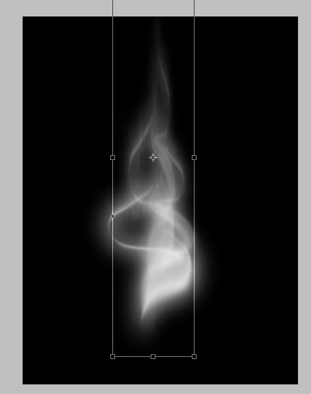
Creating Smoke in Photoshop!

In this tutorial, I will show you one of the ways I make smoke in Photoshop.


Step 1. Create a document with a black background. On a new layer, draw something similar to what you see here using a soft edged brush. Make sure at all times throughout this tutorial, that the smoke layers are not merged with the black background layer.


Step 2. Duplicate the layer and Gaussian blur it. I used a setting of 23. Then merge the two layers.


Step 3. Duplicate the newly merged layer. alt/click the layer to select it, then go to select/ modify/ contract. I choose 10 pixels. Then invert the selection, and delete. It should now leave a thinner version of what you had on the other layer. Then lower the opacity of the layer behind it.


Step 4. Merge layers. Then duplicate the layer again, and resize it, and move it to somewhere else in the smoke. I moved mine to the top and center, and then flipped it.


Step 5. I then used the liquify filter on both layers, slightly tweaking both layers to give it more of a smoke effect. Now merge the layer.


Step 6. Now duplicate the freshly merged layers once again. I then went to filters/distort/wave. Use the default settings. Then lower the opacity of the filtered layer. Merge both layers.


Step 7. Now duplicate the layer and go to control T, and make the smoke thinner and taller. Merge the layers.


Step 8. I ran it through filter/liquify again. I tweaked it a little more to give it more of a smoky feel.

Step 9. Create a new layer and set it to overly. With whatever color you would like, start to give the smoke some color. I used a reddish color.


Step 10. I repeated step 9, and added some blue to the smoke.


And there you have it. Smoke in Photoshop.

Labels: , , , , , ,


philwebsupport


My Topsites List
Open Web Design
Back to top


Designed & Developed by
chris paragas